
CLEAN ENERGY DRINK
PROJECT TYPE: GROUP
OBJECTIVE
Make a clean energy drink that is free from caffeine, and processed ingredients.
Cater to an audience that is concerned with health as well as consuming organic energy.
PROCESS
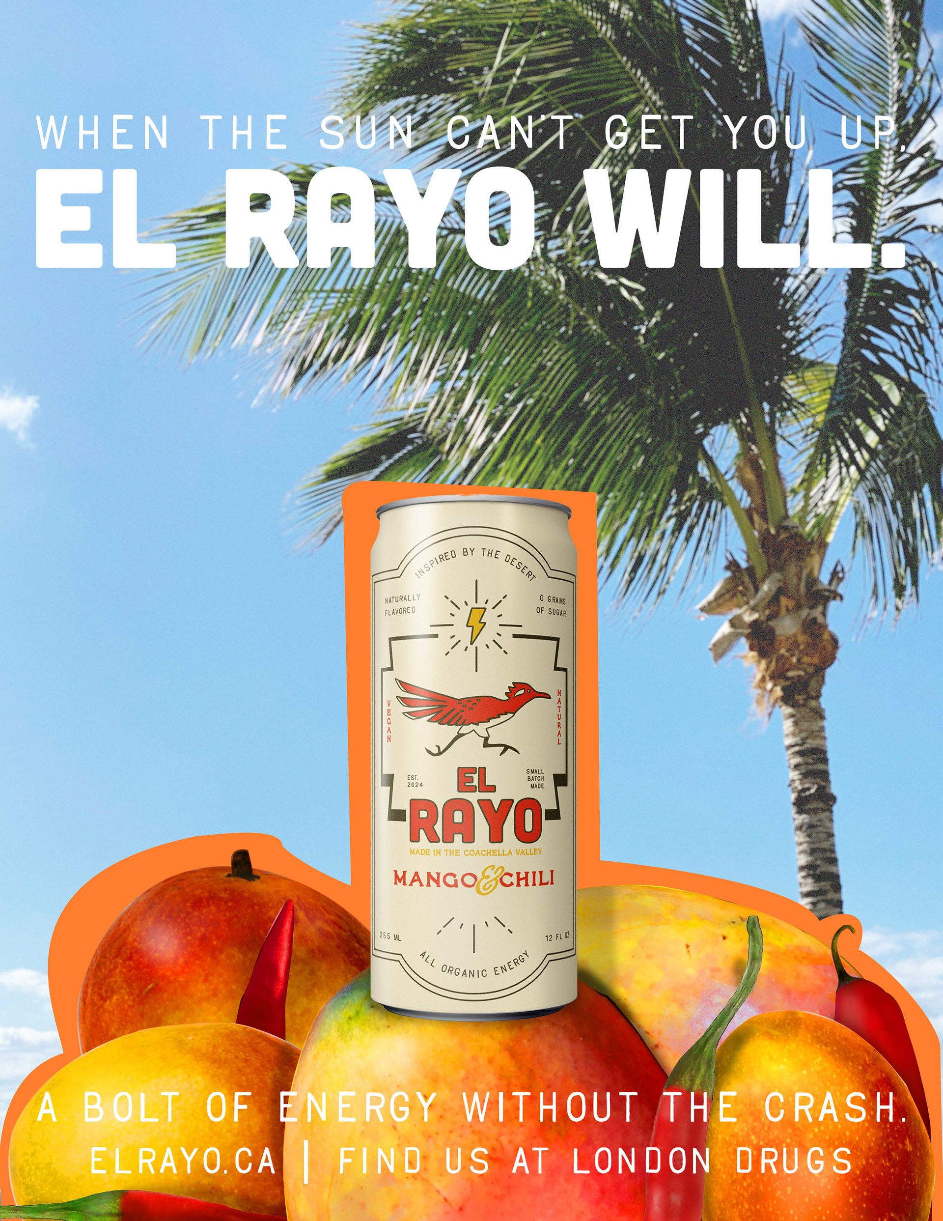
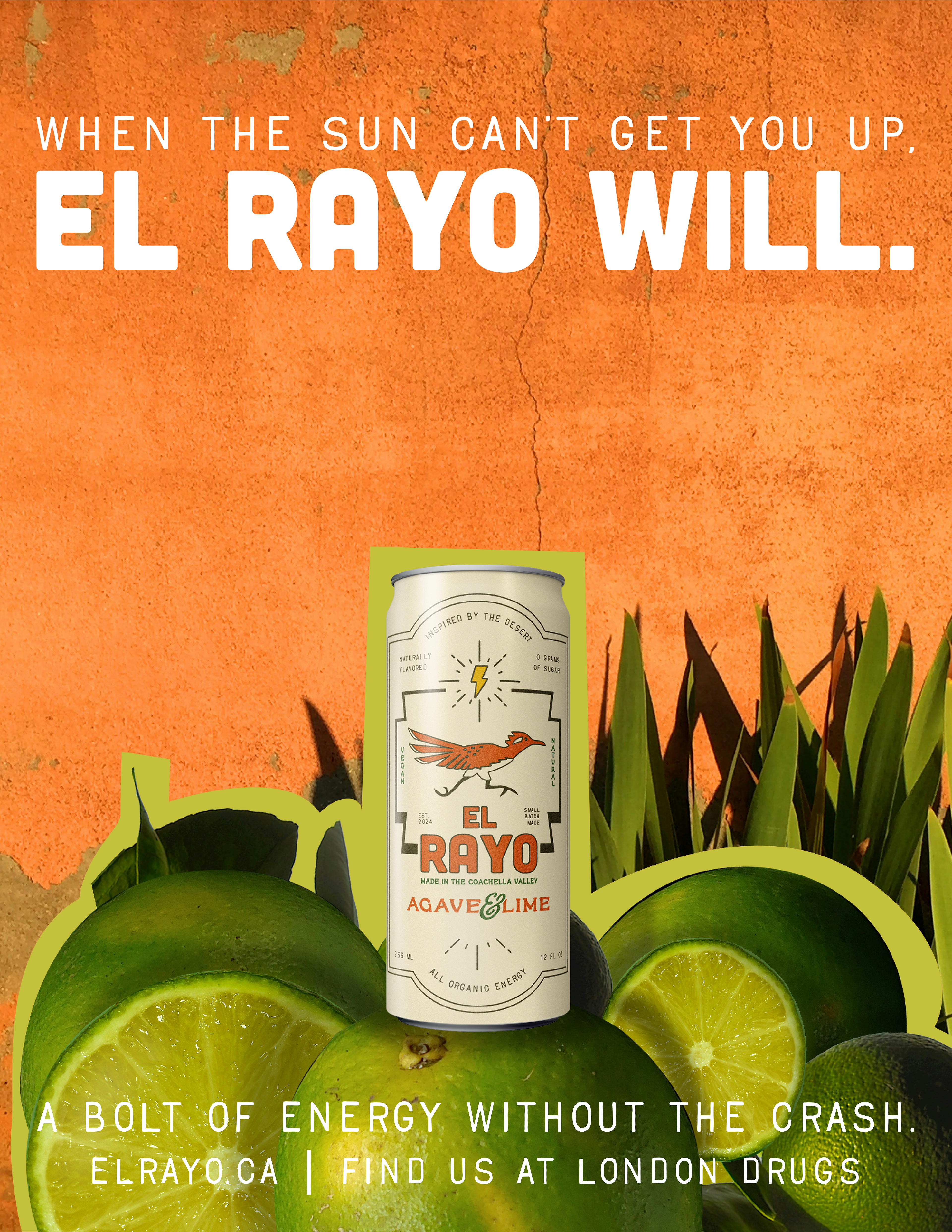
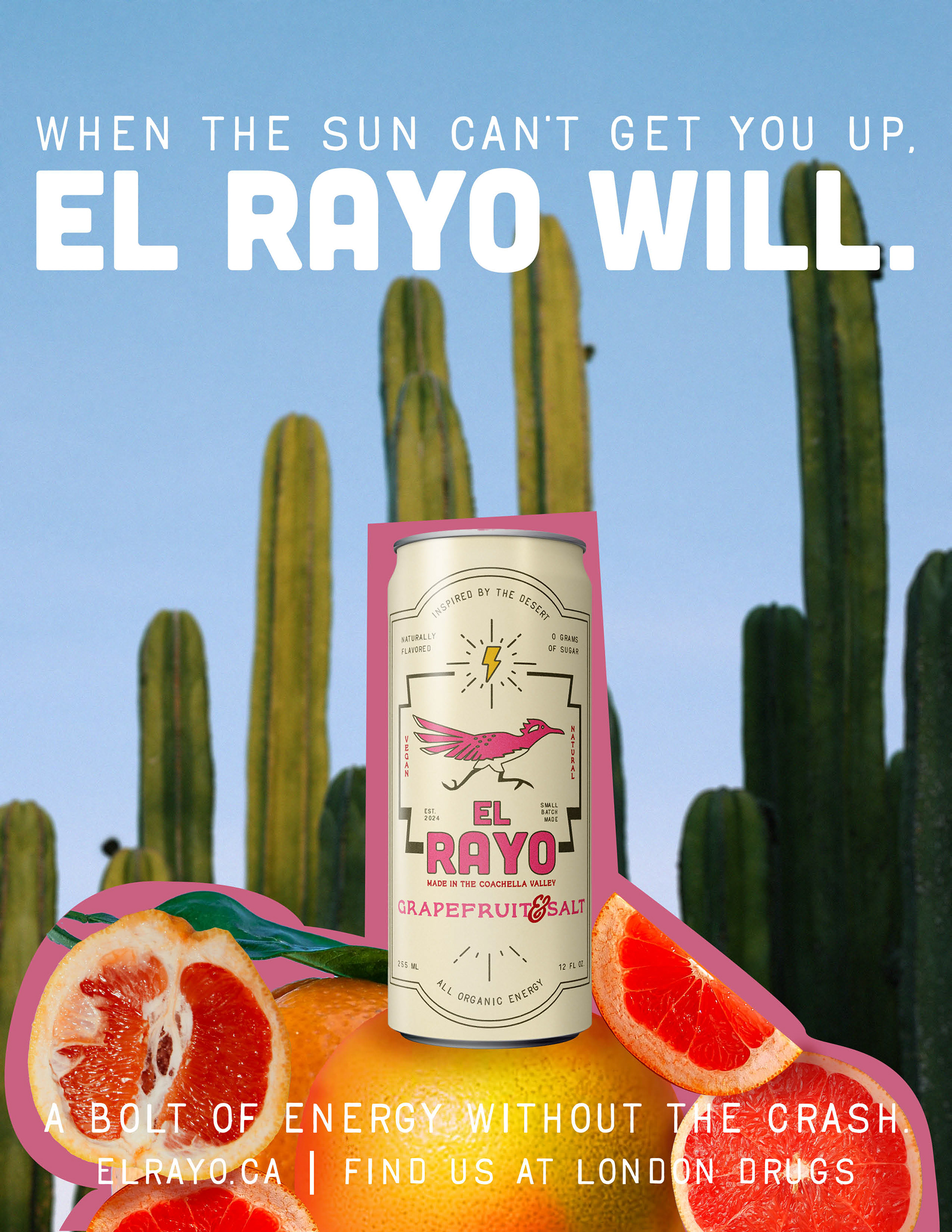
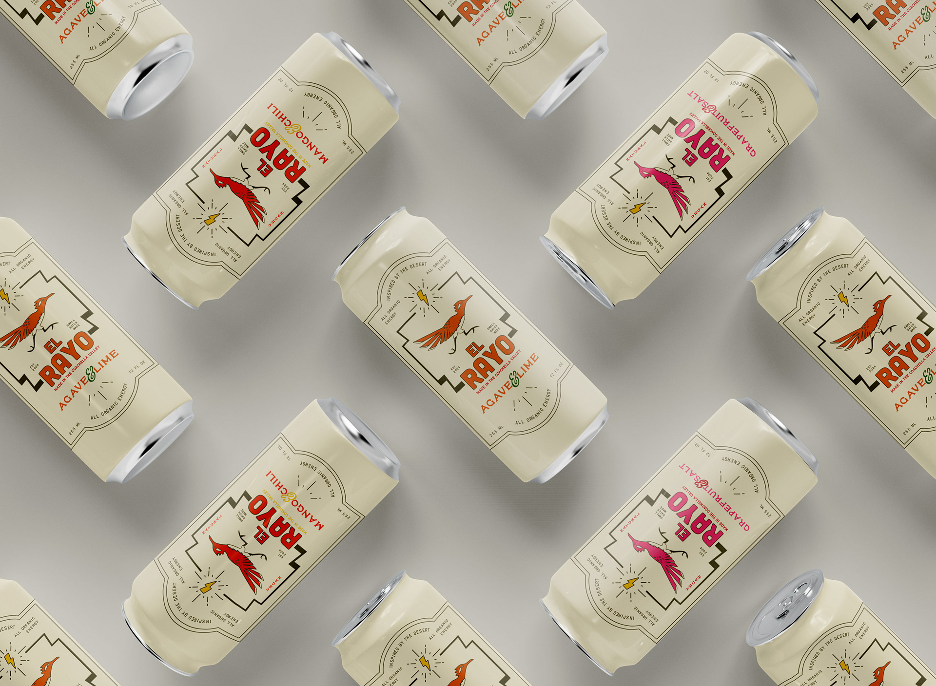
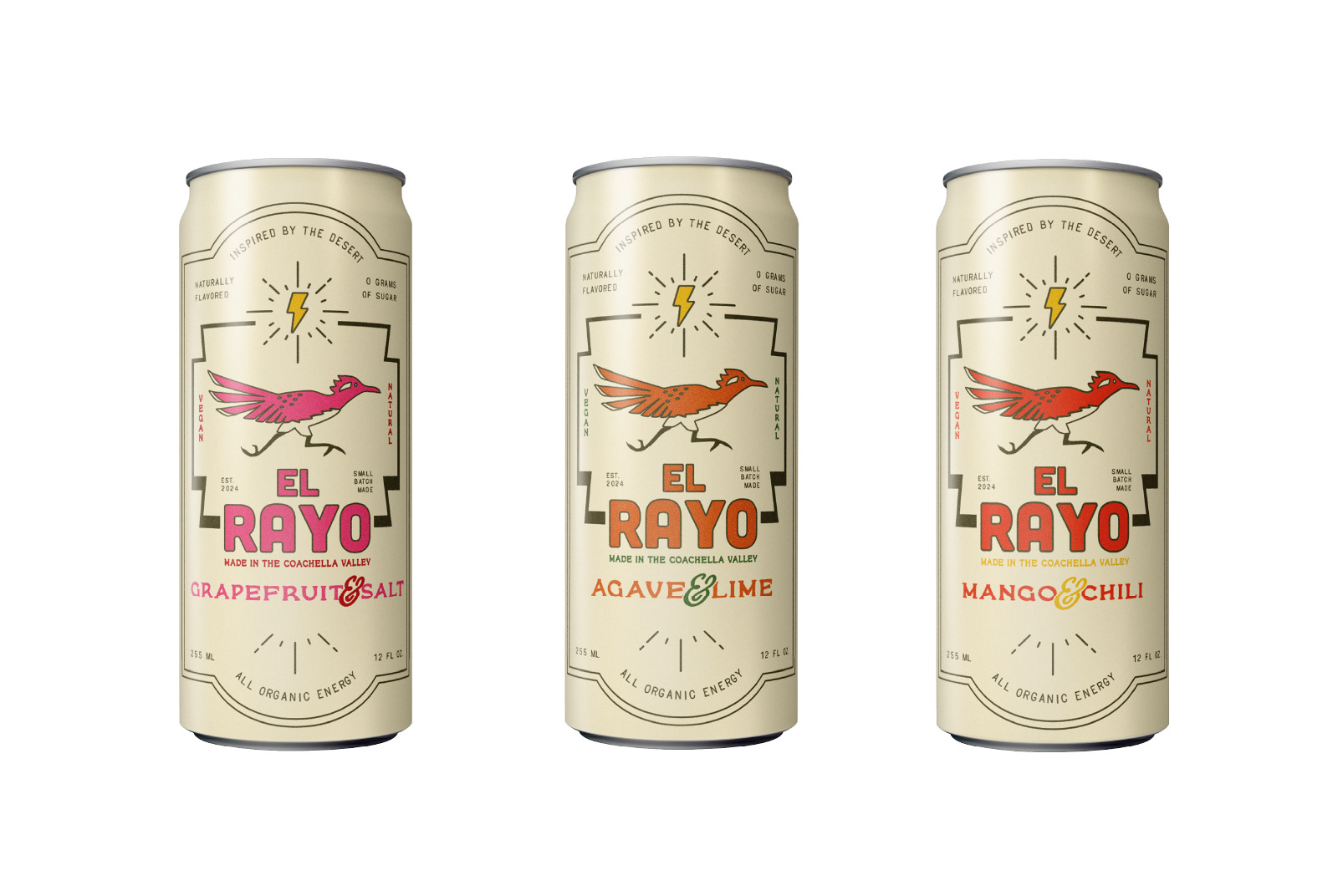
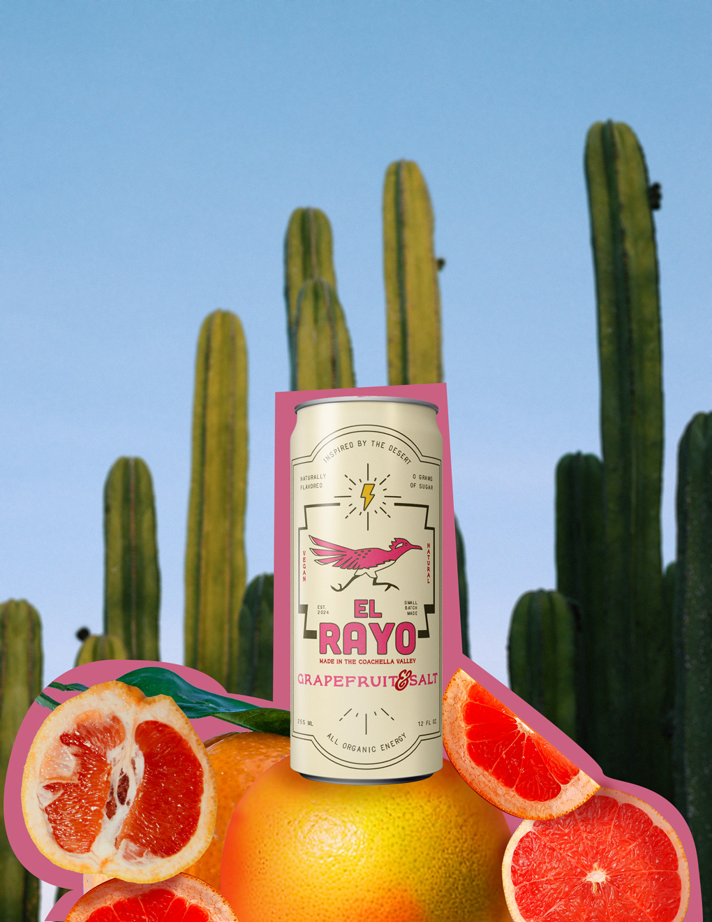
My team and I started to work on our colours, logo, and typography. A roadrunner and lighting makes for a great graphic for energy. We added Spanish influence to match our exotic flavours.
The audience we chose to cater to, were people who enjoyed organized exercise. Pilates, spin cycle, yoga, etc. People who care a lot about aesthetics. We offer them a clean design that they will be happy to strut around with.
My partners took on the role of logo, type and packaging design, while I started to work on the ads.
el rayo - "The Lighting"
MY PART
- Photoshop -
I worked on the ads for our energy drink.
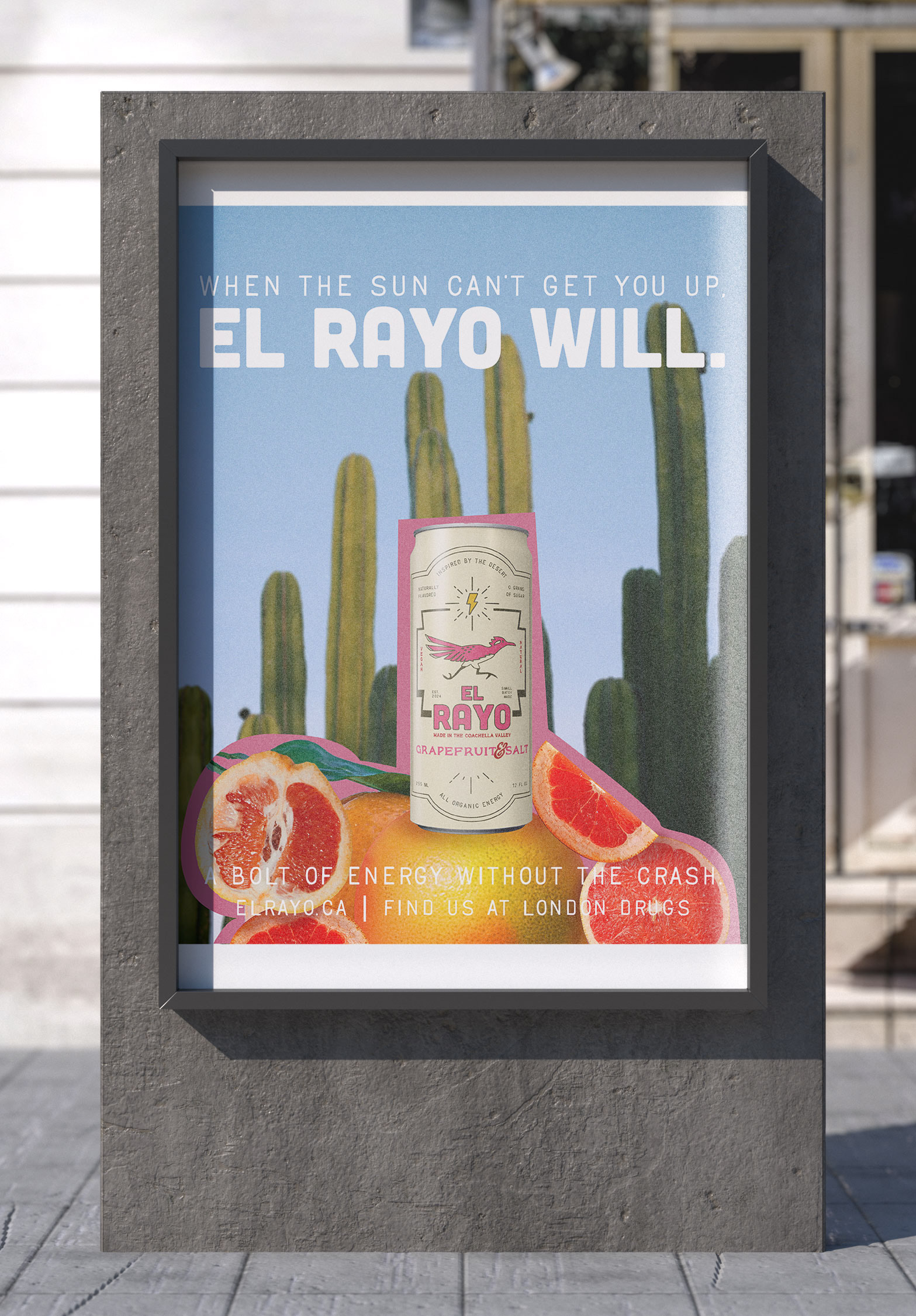
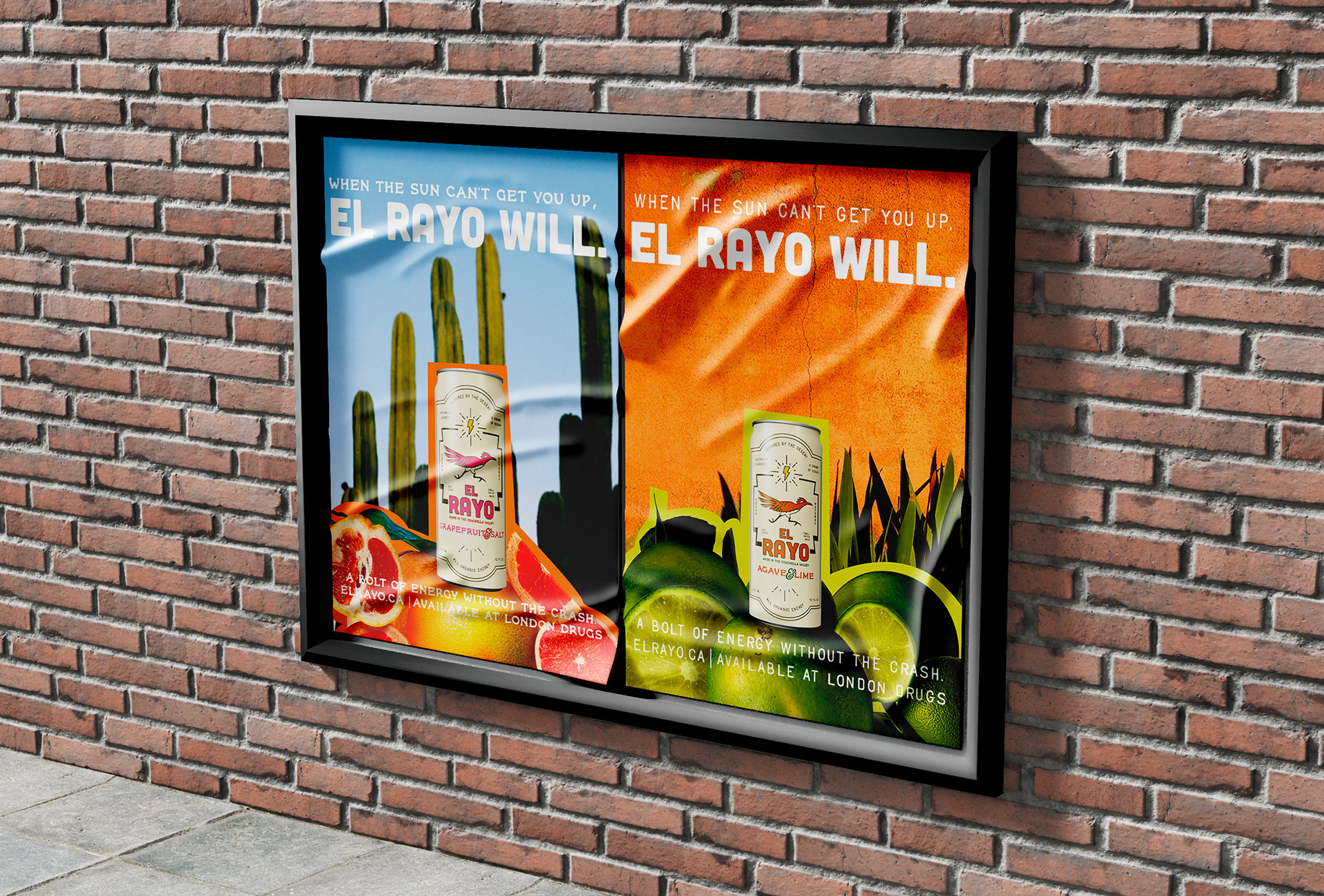
After brainstorming what our vision was and who we were catering to, I decided to go with a rustic, desert inspired add.
I first got pictures of fruit that correlated with the flavour and cut them all out using my pen tool.
Once I had gathered 5-6 images, I brought all them onto a new PSD. I used the lighting from the can mock up and the background image as a reference. I added in yellows and reds with my brush tool, using soft round and low opacity. I did this is multiple layers.
Once it looked cohesive, I used effects to blur the background, giving it a portrait look.
I sampled the colour of the text and used my pen tool to add a choppy background to the can and fruit. This gave the ad a rustic feel.
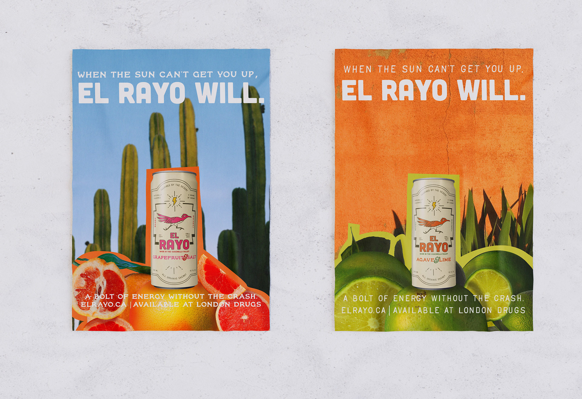
FINAL ASSETS